Sunday, April 29, 2012

Lost in Time & Space

Let us float into space.


There's always a place inside me filled with galaxies and outer spaces. In my younger days I collected found & given marbles (never bought) and bouncy balls (from party bags & leftovers from my own parties) which I had more recently, during a not-quite-spring clean, gathered & placed them into jars. For me I felt like I had captured a bunch of planets and kept them alive in these jam jars.


As kids, we grew up living on fantasies. We built them with our imaginations and the things we could find around us. Sofas, chairs, bed sheets, and the lights turned off could turn a bedroom into the universe and we'd fly amongst galaxies in our hand-heart-and-mind constructed spaceships. This was one of the adventures Bambi and I went on during our childhood. These things get lost as we grow but it's never too late to live them again; imagination - the creative energy we've all been given, will always be the greatest gift we'll ever have. Some realise it. Some don't. But it's all within each of us and actually... it was never lost to begin with. We're always dreaming. We all get caught up in these dreams. It's these dreams that could transform the world around us. But perhaps they escape before you live them, as you stay attached and firmly grounded on the Earth. Sometimes all we need to do is defy gravity and float freely with our imaginations.

The Passing 2011 Comic designed for University Project

I didn't think of it that way then, but I think this comic I made for a university project in the subject called sequences and narratives actually fits in (not completely) with the ideas I have above. This comic was actually initially based on my frustration on not being able to articulate and express ideas properly; they escape before you're able to make them into something tangible leaving you with only fragments. Meaning gets lost within that moment of translation from thought to speech.  I intentionally left the comic vague enough so that it could be interpreted in any way you like. The version you see here isn't the one I submitted, this was another version I had as an option with some minor tweaks and improvements. Still, I call this comic a visual conceptual work in progress; I have a lot to work on in terms of creating the right dynamics to express movement within a frame and especially as a sequence.

I think the space theme also had somewhat been influenced by the music I was listening to at the time. I was really into The French duo Air and listening to them always expanded the confines of standing in the corner of the peak hour train into a world faraway into space. I felt like I was floating in some sort of dreamscape


Air - Le Soleil Est Près De Moi


Air: Universal Traveller

So far, so far 
So far away

I remember when night shopping used to be a ritual and I'd always get excited about it. But ever since uni the frequency of going grocery shopping with my parents seems to have decreased quite drastically. So to my disappointment, I came to a realisation that these scrapbooks are no longer widely available... it kind of hit me how long I haven't properly perused my local supermarket... it's like someone took a chunk out of my life. Seriously though. When did these scrapbooks begin to disappear? (It could just be me not looking hard enough so please do let me know if you ever come across them)

This Scrapbook has lived for years... since primary school even.

So maybe childhood partially gets lost along the way without us even noticing but thankfully I've kept some of the artefacts & memories that made those days truly worth it.

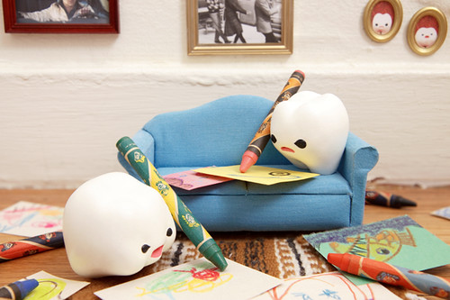
I drew this with my set of twist-crayons one arvo probably when I was 9 or 10. They were the good ol' days :)


Wednesday, April 25, 2012

The Colour Wheel


Colour Wheel based on Newton's one for my Magazine cover project.
  
Colour wheels are so traditionally part of the visual arts that we rarely immediately associate them to the visible part of the electromagnetic spectrum; the science side of colour. Upon my internet visual research trip, while searching for things related to the colour wheel, I stumbled across this website which perfectly merged my love for art and science in the context of colour systems. One might assume colour wheels have their origins somewhere along art history but actually it was Newton who was attributed to being the the first to explore such a system. We're all probably familiar with the idea of a prism being able to separate and disperse white light into the 7 colours of the rainbow from highschool science. But what Newton noticed was that the ends of the spectrum could be connected to form a circle (a closed system) which led him to created his colour wheel - a spinning disk when spun at a high speeds would blur the colours and make them appear white to the eyes.

Diagram of Newton's ideas from Colorsystem
The website (Coloursystem) unravels the history and development of colour systems (as I said mentioned above) in both the context of art & science. I think what really drew me in was the lovely visual language of the diagrams which communicated this crossover of art and science really well; something I wanted to explore in the design of the colour issue of my Magazine cover project. This became the basis for the development of the visual language I had for the colour issue: scientific diagrams merging with the natural textures of traditional mediums of art like pencil, paint, & collage.

Energy & Eyes: Handmade Sun Collage set against two different colours to demonstrate the optical illusion.
As an afterthought, even though my initial concept was about colour as energy I realise now that perhaps what it could have evolved into is the idea of colour as perception which could allow the incorporation of an earlier concept I had of colour blindness. Colour is more complex than simply understanding how to mix their pigments or even by understanding the physics of its light nature, since it is more so the reading of the brain and the perception of the mind which bends the way we perceive and experience colour. Strange things can happen with optics and even though you might be looking at the same colour with the same wavelength and frequency, once you put against a different colour somehow that colour seems to turn into something else.

/Ham

Saturday, April 21, 2012

Parallels / Awkward


I don't always watch or keep up to date with MVs but I always find that it adds another layer and dimension to the way we perceive and receive music. I discovered Awkward by San Cisco just yesterday, and like Gotye's (ft. Kimbra) hit Somebody That I Used to Know, I was initially caught up in their quirky MVs which got me addicted to the dynamic and colourful sounds of the songs. 

Unintentionally, however, I found that there were parallels emerging between the two (I mean look at the screenshot of the youtube clip! I was so amused when I saw that). I realised that they have a lot more in common than expected; awkward romance situation, misunderstandings, and two sides of the story singing in the same lyrical structure. It's a beautiful coincidence and I love it.


The sound of Awkward is as fresh as it is unique with the lead male Jordi having a very boyish kind of look and sound which suits the colourfulness of the pop tune while the drummer Scarlett who debuts vocally in the song has a really unique character - her voice natural & kooky in a cute way which I think matches up with the tone of the the song really well. Directed by Andrew Nowrojee the MV is quirky and creative: neutral facial expressions, minimal pastel toned retro setting, text messaging visuals and bubbles, camera shots sliding in the same kind of way as how page slides on touch phones, switcharoo-ness and the randomness here & there. Here are are my favourite moments:

lol at the random head popping out, the random dog, and the arms.

I realise both clips have stoic neutral expressions; even though they sing in the presence of each other you can feel the distance and disconnect. There's something really intriguing I find in that. 

It's honestly hard to capture the dynamics of Somebody I Used To Know with still screenshots... 
I really love the slow panning of the camera, the still moments, the heavy sighs, the flashes & stop-motion movement of the paint and the way it comes on/off in Somebody I Used To Know there's something really edgy and tense about it which really works with the song. The artists become like living artworks. I particularly loved the moment when the drums started beating and Kimbra did her shoulder role and step closer. I don't wanna live that way. I find Kimbra really mesmerising kind of in the same way as Katy Perry. Overall the clip is genius; it's raw and artistic.

and not to mention I also really love the colour scheme of both clips:


I love the things happening with Australian music. Period.

Thursday, April 19, 2012

Inventory: Muji

I discovered Muji early this year when I was in Thailand. It was an outcast day and I was doing some housework, folding clothes & hanging up the wash, only to be spontaneously invited by aunt's friend to do some shopping therapy and treat ourselves with some Japanese food at Fuji in Bangkok Central Plaza (she was fustrated by her husband so it was women's instinct to go on the escape). Naturally the invitation was accepted with an immediate yes as the days for outings and excursions were on its final countdown. You could call it luck because I had no idea what or who Muji was until we accidentally stumbled upon it while pondering around feeling a little bored (since the complex felt much like the department stores in Sydney). As my eyes hit the wooden interiors I knew it would be good - finally something worth the trip to Bangkok - and it was indeed very very good.

Photo by Hamlet & Story (c) 2012
The ambience was amazing. Wooden shelves. Illuminated space. Minimal design. All accompanied by this Japanese mountainy folksy sort of music. It felt so good, so natural... it made you want to run away from civilisation and live in your own Japanese-tea-house-hut on a mountain with 360 degrees of spectacular views.


Photo by Hamlet & Story (c) 2012

Photo by Hamlet & Story (c) 2012


The Muji philosophy is simple; products of simplicity, high quality & reasonable price. Muji lives up to this with their less is more aesthetics and wonderful quality. It considers itself as a 'non-brand' as their identity has no logo but is characterised by their packaging which incorporates simple brown/recycled paper with blood red colour scheme. While it's not particularly cheap, the price tag isn't exaggerated either; when they say reasonable price they mean it. After extensively browsing the store and pretty much falling in love with every item I touched I ended up settling with four goodies: socks, stockings, pyjamas and tunic (as price had me feeling slightly guilty I didn't splurge as much as I would have... particularly since I was in Thailand where things are meant to be 'cheap', the cost of Muji products would seem exaggerated even though they're standard in Australia).  Despite the price (and perhaps that it is made in China... like all things) which initially made my stomach flip, I'm telling you it's worth it - the beauty is in the simplicity & preciousness of the materials - the timeless design means it'll last you a long time... forget disposable.


Photos & design by Hamlet & Story (c) 2012

  1. 90 Degree Angled Muji Socks / Wine Red / Dotted: They're super soft 
  2. Ladies' Tights / Horizontal textured
  3. Ladies' Sleeper / 100% Cotton / Light Pink & White Gingham: I've worn this over and over like crazy. It's so comfortable! My favourite PJs most certainly. (and has pockets)
  4. Ladies' Tunic / 100% Cotton / Cream & Deep Burgundy / Striped: I don't usually buy anything like it - but I was somehow intrigued to try it on and it felt good. It also has pockets and the material is also quite thick so it's great for winter.
  5. Brands A to Z: Muji by Peng Yangjun and Chen Jiaojiao / published by Southbank Publishing: I discovered the book in my library while trying to find White by Kenya Hara (Only to realise that Hara is the muji advisor + art director of Muji... but I'll stop talking he deserves a post of his own)


Although Muji was a new discovery to me, Muji is in fact not at all new and has actually been around for while now since the 1980s in response to the cheap poor quality products that were dominating the supermarket environment. Today the Japanese company has chain stores around the world (one of them being Bangkok but none in Sydney as of yet *sadface*) selling over 7000 products of which are mostly household products. Among the store I visited I also found these beautiful bed sheets which felt and looked amazing, very soft men's cardigan in my deep red/purple colour (unfortunately not vegan), and compact earmuffs (would love it for switzerland :3) just to name a few highlights. There are stores in Germany so you know one of the places I'll be at next year :)

The Muji compact ear muffs / Photo from Good Things blog
/Ham

Wednesday, April 18, 2012

Hunt & Gather: Korean Creative Culture

*WARNING: Super long post ahead / skip the intro for the main course*

Growing up in the area of Belmore/Campsie and 15 minutes away from Strathfield where there are thriving Korean communities I've always been exposed to and interested in Korean culture where Kimchi and Ramyun have forever been woven well into my life. Perhaps it was the warming motherly nature of my neighbour and childhood friend's mum who always welcomed me like I was her daughter and later on, the discovery of the magnificent array of small but well-balanced & colourful Korean dishes (you'll see me post more on Korean food soon enough), that brought me into the charm of Koreans. I will always remember: sitting on the floor eating short grain rice with seaweed soup on low tables which all contributed to the homey-ness I felt in my childhood friend's house and of course the beautiful melodious music of their language.

Today Korean culture has exploded all over especially with the hype of Kpop and Kdramas (particularly but not limited to in Asia) that there is even a Canadian couple making a living out of reviewing K-pop and documenting different aspects of life in Korea on Youtube. But what I'm more interested in are the amazing and beautiful things happening within the creative scene of Korea and there is a lot happening.

Here are some of my picks:

1. Full Moon Story: Editorial Photographs by Kim Kyung Soo for Korean Vogue

It's only appropriate that I start with this one as this was one of the first beautiful discoveries I came across during senior highschool while I was doing some visual research for Textiles & Design around 3 years ago. Only a year or 2 later did I find the rest of the collection. I immediately fell in love with the subdued colours, organic forms, and the charm of the traditional Hanbok; The photography and styling is simply amazing. It's gentle, quiet and simple yet there is so much depth in its poetry. Even though I found this years ago I still absolutely love it.


More here.

2. Wowsan blog by Monika and Satu

Started by designer Monika and photographer Satu who are currently living in Helsinki (check out the interview here), Wowsan is a blog which documents the creativity of art, design and lifestyle within the contemporary culture of Korea whether it be illustration, photography or music (plus more). Though they don't update as frequently as I'd love them to they still give me a good fix of things happening in Korean modern culture. I'm excited to see what comes next as they'll actually be in Korea this year and will be able to document things firsthand. Here are a sample of things they post (Clicking on the images will lead you to the original post)

Street art by artist & painter Junkhouse


Left: Wonderland project by Yeondoo Jung who transforms children's pictures into photographs

Right: Big bang from A graphic cosmogony (2010) illustration by Yeji yun


Design by Sulki & Min Choi
Sketchbook by Pooroni Rhee


Like most things I find, SSE Project was found by accident I can't remember where or how but that doesn't matter because I have found it and that is that. It's a Korean based online gallery which finds and selects artists (not limited to Korea) to exhibit. They also create zines for the artists they showcase and do an offline group exhbition + event called 'Troublemaker'. Their zines are also distributed here and there around the world and are absolutely amazing and inspiring (I'm hoping to one day be able to publish some zines). Following photos are via their Facebook page; join it and stay up to date with their project.


There's probably no word to describe the delight I felt when I found this little treasure. Alien's Day Out is a blog run by Mipa Lee who posts about her life as a vegan in Korea. She runs an online bakeshop and is also an illustrator! Vegan? Baking? Korea? Illustration? Check. Check. Check. Check. It's no wonder why I adore this blog so much. Mipa certainly has one of my dream jobs :3 blogger, baker & illustrator. The combination so perfect.


5. My Milk Toof by Inhae Lee

These absolutely adorable photo narratives following the mini adventures of 2 baby tooth were introduced to me by a friendling. It honestly tickled my heart and I'm most certain it'll make you go 'awwwww'. Besides the cuteness I think the photography, set, story and characterisation is absolutely wonderful! Check out the blog to see more of the journey of these little critters.


6. Art + Seoul Magazine

I really adore the name of this magazine which documents the art and alternative culture in Seoul. I haven't had the chance to get my hands on this maga but they do have a blog which is worth looking at to immerse yourself into the creative world of Seoul. 


7. 김대현 Daehyun Kim (also known as 무나씨 moonassi)

I came across these amazing illustrations via tumblr through bookspaperscissors. This discovery is probably responsible for making me post this post. The moment I discovered that this was by a Korean illustrator I knew I just had to blog about the amazing things growing in South Korea. These simple illustrations evoke a lot of poetry and captures the inner feelings of life and self through the minimal tone and surreal forms of the figure/s. There's also something really spiritual about the series. I think what really caught me were the title of each piece which really pulled me into the image and enhanced its meaning.

우주 건너, Across the universe 2009

불면의 낮, Sleepless days 2009

너 넘어 너, You're beyond you 2009

불면, Faces that I have to face before I sleep 2010

View the whole collection here

8. Wire Mesh Portraits by Seung Mo Park

...and this discovery only confirmed me to make this post asap. These beautiful portraits I found via This is Colossal are by Korean sculptor Seung Mo Park and have been made with layers and layers of wire mesh meticuliously cut to form these evocative portraits. There's more images and videos on the process on the This is Colossal post so be sure to click on the images to be linked to the full post and watch the video!


/Hamlet
Related Posts Plugin for WordPress, Blogger...