 |

Friday, June 29, 2012
9:24
Web & Past
Last year I did some web designs in a previous subject called Sustainable Lifestyles which required us to come up with a design proposal for an issue we selected. I chose an extremely controversial topic - something along the lines of the visual communication of climate change. Honestly at the time I didn't really know how to propose a website technically, so I'm glad to have now learnt the main structure of a web design proposal which includes a competitor analysis (a research on what competitors are doing with a conclusion on how we can do better), a sitemap (maps out the main links on the website), wireframes (the architectural structure of content) and mock-ups (visual design of the website).

Since the end of primary school I started taking interest in html when I was in the phase of being obssessed in customising my own layouts on Neopets for the guilds. From there I learnt the very basics of html, Dreamweaver (back in the macromedia days), copying codes and adjusting them to fit my needs. So the language of html is a familiar one though I am no where near fluent but I think those years of "experience" and play certainly helped. I can't imagine starting from scratch! Good thing is I pretty much have already broken all the rules during those years of play so now I shall be able to leave that behind and build websites the proper way adhering to za web standards.
and for your amusement (or even heart attack) here is the past:
 |
| http://fantaisya.110mb.com/ My goodness I stumbled across this not realising that it was even still alive on the internet! I did this in year 11 for this youth business programme YAA (Young Achievement Australia). I was part of the marketing team... and we were shamefully selling "customised" underwear. I broke all the rules: table based layouts, shocking colour scheme, using gif for photos, internal scrollbar, and not to mention you are welcomed with a countdown that exceeded its limit a long time ago (you now see negative values). |
Intro to Web Media
This post has been sitting in my drafts for a while now and seeing as I'm already half way into a 3.5 weeks winter school it's probably about time I post this. Intro to Web Media is the subject I'm currently doing and has certainly been exciting so far. Deadlines have of course been tight which has been tough (no time to change your mind) however I'm finding the computer tutorials excellent; I finally feel productive in these tutes (although I do notice I have a tendency to lose focus after 2 pm). The skills we're learning are practical and I can imagine applying them in the near future. There's also a nice balance between left and right thinking. I find coding rather therapeutic and it's certainly a nice break from from the usual brain-straining-creative-conceptual-thinking; coding is another kind of problem solving like a puzzle with the bonus of being able to see the results then and there (it sort of reminds me of maths something which I miss *unleash the inner nerd* haha).
I think this subject leads on nicely from Type for Print (TFP). Before I didn't understand why TFP was a prerequisite but now I realise that web design goes beyond learning the html and css or constructing layouts in a digital format. People often distinguish between the two mediums of web and print, but by understanding the importance of grids, the usefulness of style guides and how typography is essential to design - I realise the principles of print can also be applied to the context of web.
Also, another reason why this subject is a nice lead-on from TFP is because we're basing our website on a chosen magazine! By the end of winter school we will have completed a redesign of the magazine's website (not the full site however). Those days immersing in the world of magazine sure will pay off as I have a decent amount of firsthand experience of being the reader/audience of magazines and keeping in touch with their websites.
Thursday, June 28, 2012
Bodhi Restaurant
I've always I wanted to try the food at Bodhi and was able to last friday (22/06). Unfortunately we missed out on the yum cha since they only run it during lunch we went there instead for their dinner menu. Did I mention that everything on their menu is vegan offering a fare of asian-fusion fine dining? The restaurant is tucked away between St Mary’s Cathedral and a swimming pool in the heart of Sydney. Its location is quite hidden so they must good to be able to get the amount of customers that they do. The restaurant is quite small but with a cosy and I must say, romantic ambience created by the dark lighting and candle lights. And woahh I didn't realise how classy it was... dressed up waiters and friendly full service.
We started with some edamame beans (I forgot to take a photo) but quickly the mains came.
 |
| dry roasted salted peanut spices topped on fried eggplant with a celery and asian mushroom stuffing $17.50 A little on the oily side (friends weren't too crazy about it) it was still delicious for me the salted peanut topping complemented the crispy oily eggplant well. |
 |
| malaysian curry, lychee, asparagus, pineapple, snow pea, tofu, bamboo shoots and pine nuts $19 damn I missed out on the lychee haha friends got to it before I could. A good curry. |
 |
| mushroom, asparagus, red capsicum, soft tofu and cashew nuts tossed in a creamy coconut lemongrass sauce in an asian pastry nest $20 Also delicious. |
 |
| sour orange sago pudding with coconut cream and coconut, pandan leaf sorbet $12 Wasn't so crazy on the orange flavour... but damn the icecream was good. |
 |
| lemongrass infused rice pudding with a passionfruit coulis and caramelised sugar $13.50 This was surprisingly delicious. Warm rice reminded me of eating sticky rice pudding, passionfruit nice and juicy. Serving was tiny though... |
You'll notice the prices are pretty shocking (if you're a student like me) and the dishes not so massive... of course this is normal prices for fine dining. Overall the food is good! Is the price justified? Perhaps. I mean service was great, presentation is also wonderful. I have to admit the food isn't so exotic? I mean it would be exotic if you consider asian food exotic haha but I guess with an asian upbringing this style of food is pretty standard (Although as you can see there's a western twist to the dishes which made it fancy). That doesn't mean that it wasn't delicious though - it truly was. I suppose you're also paying for the excitement of eating at a restaurant in a nice location. Will I go again? When I start earning my own money. Although I would love to try the yumcha hopefully in the near future!
Wednesday, June 27, 2012
Catchup: Vivid Sydney 2012
Wow. This post is definitely well and truly delayed...
8th of Friday was one day exactly after I had finished the last of my assessments (A German Test) and luckily for me I was able to "celebrate" "stress-free" with my friend and a bunch of his mates (and one of his mates girlfriend and her friend also lol) at the lights festival VIVID Sydney. This was actually the first time I got to hang out with this friend. I never realised that he took an interest in photography. Funnily enough though I realised pretty much all my male friends are photography enthusiasts. All the photos here are unedited mainly because I was lazy and also because I thought there was something interesting about darkness.


 My attempts at focusing at night are always a failure. Something I need to practice... It's always hard to see during night. I keep forgetting that there's auto focusing as well so I didn't quite make good use of it - although I doubt it would have helped me very much.


8th of Friday was one day exactly after I had finished the last of my assessments (A German Test) and luckily for me I was able to "celebrate" "stress-free" with my friend and a bunch of his mates (and one of his mates girlfriend and her friend also lol) at the lights festival VIVID Sydney. This was actually the first time I got to hang out with this friend. I never realised that he took an interest in photography. Funnily enough though I realised pretty much all my male friends are photography enthusiasts. All the photos here are unedited mainly because I was lazy and also because I thought there was something interesting about darkness.
This was where we began our journey! At the top of the overseas passenger terminal. I love the views from up here and it wasn't so crowdy and man it gets seriously crowdy down there I couldn't see anything! And here you have me attempting to shoot sans tripod in the dark.
Of course without any tripods at hand my friends and I grabbed at whatever we could turn into a "tripod" i.e. hand railings. Lucky for us we had a nice flat and large surface. For a while we stayed up there and I managed to capture people coming and going - all who had a camera of some form whether it be mobile, digital compacts or dslrs.
Call me no night photography pro and photographer for that matter. To be quite honest, with all the people nowadays with dslr cameras there's a little more pressure to take "good photography". But I think many people are doing that enough already and all I really want to do is just play and have fun! All of course while trying to learn and master the art and technical aspects of capturing light. Part of why I love "photography" is being able to document moments, people and capture things in a new light and perspective. So while this photo may be dark I like it because there's something mysterious to it.
Photoception! There was something wonderful about the 3 friends. I loved being able to witness the dynamics and interactions between the best mates.
 My attempts at focusing at night are always a failure. Something I need to practice... It's always hard to see during night. I keep forgetting that there's auto focusing as well so I didn't quite make good use of it - although I doubt it would have helped me very much.
There were many lovers during Vivid and I managed to capture this couple. I actually really love this photo - if it weren't unfocused it would have been almost perfect. The lights turned colourful on time too.
Avatar/Smurf man. This was a completely unintentional and accidental shot and probably the sharpest photo I took during the night haha. When I saw the result I started laughing so much because my friend was so blue he looked much like an avatar creature. He just laughed and liked it also so it was all good.
Time went by so fast and the night ended so soon. It was time to head back. Unfortunately we didn't get to go any further which would have been nice as I felt like the fun only just began here! There's always never enough time in one night for vivid.
Tuesday, June 26, 2012
Objects of Everyday
For me the visual documentation of everyday objects will never get old. Artists and illustrators may be doing the 'same' simple thing of drawing and painting objects and ephemera over and over again but for me, every time I discover such works there's always some new and fresh in their perspectives. Each creator brings in their own individual touch and I am inspired by that. I'm hoping sometime in the near future I will be able to do my own documentations of everyday objects and ephemera - perhaps of all the small collections I have.
I especially love when there's a story attached to the objects - there's always something magical about that.


1. Grace Lee: featured on Anthology blog's Sketches Exclusive Series
"Patterns from my electricity, gas, water, and mobile bill envelopes. I’m pretty sure the inside of utility bills back home were white. I don’t even remember keeping them."
"I got this top from the local ward office bazaar. It was a lucky find, because the market was being held on the day I just happened to be going to get my resident card renewed. Plus, it was only 150 yen! I love the painterly floral pattern on the black fabric."
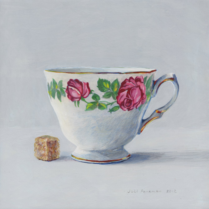
2. Joel Penkman: A collection of painted still life studies.
Penkman has an extensive collection you simply must visit his portfolio!
"I love food, and I love to paint, so combining the two seemed like a good idea.
My compositions are simple still-life studies with clean backgrounds to make easier for individuals to make a connection. Food triggers memories and emotion, I like that people can bring something of themselves to the artworks. My favourite medium is egg tempera. It is very time consuming as I make the gesso to prepare my boards and grind my own paint to mix, but the results are worth it.
....
I hope my pictures will make people smile." - Joel Penkman


I mentioned Maira in a previous post.
I absolutely love the commentary she adds to each illustration.
There are more of these illustrations here.

4. Illustrations by Dawn Tan of Handmadelove blog:
The Fisherman's Friend illustration is featured (along with many others) in the latest issue of Frankie.
This amazing lady does a bunch of lovely watercolour painted food pieces, is an art teacher and also runs a bunch of art workshops. She's so inspiring!


5. Illustrations by Christine Berrie.
The one on the left was commissioned for a dating agency. I love the way she is able to turn some objects into quirky pieces of communication. I was pretty much taken back by how simple straight forward realistic pencil drawings could be so amazing and used in a range of editorials!
Tuesday, June 19, 2012
Still & Yellow (Updated)


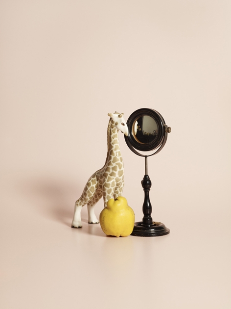
1. Untitled by Alexander Kent found via ignant
2. Mun 14: Table part of Slow Wood's Mun Collection
3. Curious Science Still Life by METZ + RACINE
Saturday, June 16, 2012
Pigeon Hole Magazine Final Covers
And finally the covers...
Yes the colour for the typography issue did change as I was worried that the yellow would be too striking. This colour was a bit too dull in the print but there wasn't much time for adjustment. I seriously need to learn to work at a faster pace so I can spend more time getting the print right! Print is so tough. I ended up having 3 variations of the cover for the first issue but only handed in 2 because I kind of smudged the 'k' cover during cutting and mounting. Overall I was happy and pretty much satisfied which is a rare feeling but of course there's always room for improvement! And yes my tutor did notice that the colour issue was the weakest also and that the image quality of the bird could have been better. That aside the marks were good (and would have been the best if it weren't for late submission haha...) and I finally feel like I'm starting to have some worthy designs.


Pixels
I had this in my drafts for a while now. These remind me so much of the "Square Books" project we had to do in second semester first year. I won't go into explaining the project because it was really broad and kind of too complicated to explain. It really does speak of simple and clear communication by using just colour and understanding a specific audience's understanding of pop culture icons.

Disney Princess Pixels via tumblr
Process: Magazine Covers III Refinement
Technology Issue:


5. I spent hours trying to re-draw the bird but ended up giving up as it was simply taking too long and went no where. From some peer feedback everyone liked the cut effect of the bird best.

Typography Issue:


2. Removed white. Edit colours. Ensured that everything was in position and balanced. I found that the transition between the drawn J (3rd last) and printed J didn't flow. So I printed out the J, penciled over it and rescanned it (2nd last J).


6. Putting it together. Yes the colour issue was definitely my most weakest one. The concept is probably not as strong as the others more like a mixture of small ideas put together in hopes of becoming a solid one.


1. Initially I used my scanning of a pair of scissors I had but they were the hairdresser sort so I decided to rescan other scissors I had. I ended up choosing the tailor's scissors as it had nice tone, texture and contrast. Also scanned scrunched up paper as I thought this would link to creatives (endless pile of scrunched up ideas) as this magazine is intended for designers and creatives alike. After scanning the images I adjusted the colour and contrast and printed it again.
2. Basically used tracing paper and outlined the main features then toned it in and scanned it. There was no time to be an "artist".

3. Drawing rocks were a huge challenge. After googling a bunch of rock images I played around with form, shading, toning, dotting and hatching. To be honest I just gave up and decided to make do - there wasn't enough time to be spending hours and hours perfecting a rock for a small feature. I do like the rocks as a collection though.
4. After scanning the drawings in, contrast and was adjusted so that each image is consistent. Tested out a range of compositions and got some feedback from peers of what worked best. Horizontal had the best balance.

5. I spent hours trying to re-draw the bird but ended up giving up as it was simply taking too long and went no where. From some peer feedback everyone liked the cut effect of the bird best.

6. Putting all the refined images together.
Typography Issue:

1. Found an image on google of the evolution of foetuses and thought it would be interesting to morph it into a letter. Looking at its shape J would work best. Printed out the image along with a range of Js in different fonts. Did a rough sketch on how it would evolve then did the final sketch. (I love how skills we learnt in first year i.e. image experimentation are being used now - in the subject we had to morph our mobile phone into another object)
2. Removed white. Edit colours. Ensured that everything was in position and balanced. I found that the transition between the drawn J (3rd last) and printed J didn't flow. So I printed out the J, penciled over it and rescanned it (2nd last J).
3. Bone on far left was the initial shoulder bone which I then adjusted to the second one so that it would fit in the 'n'. I printed out the actual letters first than did a carbon transfer onto my sketchbook so I had an outline to work with for the bone structures.
4. I had so much fun with this issue.

Colour Issue:
1. This was my first intended image for the back. But I felt it didn't fit well with the other images of the other covers in terms of style. Left was an ink drawing. Right was collage with coloured paper.
2. Went back to sketching ideas. It was getting super tough. Decided to do a take on the "chromatic diet" and have a colour wheel with a measuring tape.

3. The colour strips you are suppose to be in the ratio of the electromagnetic spectrum. Thought it would be cool to change the "unit of measure".

4. Water coloured a colour wheel in proportion to newton's colour wheel.

5. I found that triangles were a predominant feature of colour system history and decided to do a series of geometrical patterned triangles in response to that.

Subscribe to:
Comments (Atom)