Saturday, March 31, 2012

Collections: Found Beer Bottle Caps

During the first year of uni I learnt of the word ephemera which got me really excited because I had finally found a word to describe one of the type of things I like to collect. By that time, I had already accumulated a far bit of business envelopes and after having seen how they could potentially be used in a rather clever way, my mind just simply exploded in excitement.

But moving on to the featured collection...


I don't drink beer or any alcohol for that matter (nor do I support it) but there's something I really like about beer bottle cap ephemera. I was first intrigued by them when I saw them featured in the end papers of Shaun Tan's picture book The Lost Thing - in fact the protagonist of the story is a bottle-top collector himself and since I was also a collector of random things, I found it absolutely amusing (but I'll set aside The Lost Thing for now).

Since then I started to notice them scattered and strewn around the cities and suburbs. At first I didn't think much of them... but as I began to notice how often I'd encounter them - I decided once and for all to start a collection.


My favourite would have to be the one with the spades but I do love all the pictorial ones. Unfortunately I left some caps in Thailand which had Thai versions of Coke, Pepsi and Fanta (I'll probably get my aunts to pass them on somehow)! I'm hoping to find more as I go particularly vintage ones. I have a good gut feeling I'll find a fair bit in Germany :) and all around Europe. I love the thrill of finding them even though it probably looks a little suss.


And while we're on the topic of bottle caps, I absolutely love this Asahi ビール(beer) poster from the 60s by graphic artist Kazumasa Nagai. IF YOU KNOW WHERE TO FIND THIS BOTTLE CAP PLEASE DO LET ME KNOW!


Thursday, March 29, 2012

Lowlights, Highlights and Offscreen Magazine

This week has been pretty swell cancelling out all the misfortunes of this week which I by now have well forgotten. Some highlights include: Getting to see Picasso's artworks up close. Having good laughs and lots of smiley moments with my uni friends. Dancing a distorted form of tango with mum. Singing made-up theme songs for each other with dad. Coming home to new uploads on Archer&Archer and a pleasant surprise of Bakuman episode 25 and the final episode uploaded (Oh how that anime makes me chuckle).

And if I wasn't being pampered enough, the universe responded to my mental call the night before last night of wondering when my pre-order of Offscreen magazine would arrive. Yesterday I woke up in the morning noon to a pleasant surprise (delaying an already delayed breakfast) which, according to my mum, sat on the floor kind of under our front door:


As I laid in bed, I felt the excitement surging through my veins, delighted by the envelope in my hands, I observed and admired every inch and corner of the package.  


The magazine still wrapped its in a layer of plastic was in (as expected) absolutely perfect condition. A magazine has never felt so new... I think I'm probably over excited as this was the first time I've ever received something bought online... but it most certainly brightened up yesterday's dreary weathered afternoon.


Note to self: When I go to die Schweiz I must go to Berlin's Do You Read Me


The magazine which currently has the design community talking, is printed in (and sent from) Germany on 100% recycled paper and the cover has a wonderfully smooth coating feels somewhat like laser jet texture. It also has a lovely smell like freshly new timber furniture in a workshop. My only little disappointment was that it felt rather small (and its size is a little smaller than standard magazine format) but after having a flick through & reading the articles, I realised that its well worth it as it's more packed than it looks especially as its a magazine without the bulk of heavy advertisement. Sponsors do of course take up a few pages (in support of the production of the magazine) but it has been designed to blend in with the style and content of Offscreen so you don't notice at all that they're even about promoting their sponsors.


And just in case you didn't know yet, Offscreen is a magazine, dreamt up by Kai Brach (an interactive/web designer) about the people behind "the pixels" - interactive, application, web and basically anything digital design. It takes on a similar concept of Dumbo Feather Magazine with interviews as the main feature but instead focusing on the people in the 'pixel' industry. Often in our media packed world we forget that there are people - humans - behind every interactive and digital interface you experience and Offscreen aims to bring us closer to "the human side of websites and apps".


I love that it comes with a range of different features, the naming which I found clever and relevant to the industry. It's personal and rich in the stories about people, including essays, 'log book', 'chatroom', 'workspaces', 'outlook' and '10 things', which glimpses into what the industry is like behind the screen: from the view outside the office (outlook), to a diary (logbook) of a typical day of a bunch of designers. And in keeping with the trend of photographing what's in ones bag or desk - Offscreen has also taken this aboard with their 'Desktop' feature showing 10 items "on the desk of" a selected designer.


For a magazine that's related to pixels it certainly did very well in print. Design is clean, clear & simple - easy on the eyes & easy to navigate yet bold & engaging. The folks certainly knew what they were doing... You could even say Offscreen defines design of today. I do see some design features which bears some resemblance with dumbo feather magazine's new makeover such as the centred structure and hierarchy of the type on the front page, use of photography to document the lives of people featured and use of the occasional pastel coloured pages, however I think the guys at Offscreen certainly executed it much better in terms of design readability - it stands out without having to be too flashy or going overboard with having 'designerly' features. (I'll talk more about Dumbo feather later)


But I also notice that Offscreen takes on some current design trends with their old school minimal approach, bold inline condensed all caps type, use of lines below and/or above headings, black/white photos-medium-opacity-over-pastel-coloured-page, and there's even a page with vintage style typography. And I admit I absolutely love it and while it's not necessarily a bad thing to be trendy (after all it is a beautiful magazine) I'm starting to realise that trends do exist which became rather apparent to me after discovering this tumblr which poked fun at current "hipster" trends. For personal practice's sake it's good to learn why they work but it's best (as much as I do like it) to not always depend on them. After all I think it is our role as the next gen of designers to bring in fresh ideas and more unique visual languages instead of depending on the unwritten formulas of design. But back to Offscreen its still the first of its kind to actually bring this concept of "the people behind bits and pixels" to life - it's not a how to magazine but rather it pulls people from their screens, to take the time to get to know the people who make the magic happen online, to savour it in a tangible format minus the distraction of facebook or twitter. I have absolutely no regrets that Offscreen was my first online buy.


More images here


Wednesday, March 28, 2012

Hunt & Gather: Wallflower

I've been gathering flowers all over. A curated collection of handpicked concepts found by search & chance over time and collated by myself.

Flower Cones Photograph by Annie Collinge Illustration by Langdon Graves Jezabels Cover Art Flowers by Matthias Schade Wallflower Fresh Flowers Jezabels Cover Art Image Map   
NB: These images are not mine; credit is indicated below. I have only selected each work and compiled it into this picture adding numbers + colour scheme strips + title.

  1. Steckmasse / Take-out Flowers, How to carry flowers in daily life / Ice Cream waffle type / SDESIGNUNIT Collaboration with Jiseon, Park & Eunho, Kim
  2. Untitled 18/21 part of Still Life  / Photography commission by Annie Collinge
  3. Face First / Illustration by Langdon Graves / As found on Ignant
  4. Untitled by Unknown Author / Found here and posted here
  5. Flowers #04 / Photography by Matthias Schade / As found on Ignant
  6. She's so Hard / Album by The Jezabels / Cover art by Christopher Doyle / As found on Desktopmag
  7. Fresh Flowers / Concept by Design Studio Itunube / As found on Ignant 
  8. The Man is dead / Album by The Jezabels / Cover art by Christopher Doyle / As found on Desktopmag

Wednesday, March 21, 2012

History: Manicules, Fists & Indexes

"The problem is that everyone knows what the symbol is and does when they see it, but almost nobody knows what to call it." - William H Sherman


I don't know about you, but I've always found the hand pointing left/right a mystery. I've seen it around in places here and there and it seemed like an iconic classic feature but for a while it didn't seem to have a name or face. All I knew was that I really liked it. It had character. It is only until today however, that I have discovered its identity and I am finally able to pinpoint a brief story behind its birth.

With the help of Typophile I discovered that it goes by the name 'Manicule', invented by William H. Sherman who also unravels the symbol's history here. Its origins are embedded within the history of typography, a symbol popular pre-20th century, used by typesetters (usually in the margins of manuscripts and printed books) to point out significant parts of texts and paragraphs. It is curious and fascinating because for a simple function its design was rather intricate. But these hands, didn't really have an official standard name in the first place despite it being widely used during the time, they have been called and known as 'fist', 'mutton-fist', 'index' and even just 'hand' ... but since they were rather generic and as Sherman puts it "sketchy description", he decided to invent one and thus 'Manicule', the name we know today, came to be. 

Sunday, March 18, 2012

Inventory: Chup Socks


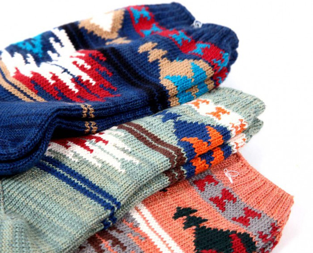
I always value quality over quantity and the Chup Socks certainly live up to this philosophy. The Japanese label Chup, (Creative Human Universal Products) by Glen Clyde, produces beautifully crafted high quality socks incorporating ethnical, indigenous & native patterns that are inspired by nature. They're manufactured using vintage stocking frame machines that weaves incredibly complex & intricate designs which means that the production process is slow where one machine is only able to produce 20-25 socks per day. They also use yarns called 'eco-yarn' which is made from recycled threads.

Needless to say... they are perfection - not perfect - but perfection. Let me write a completely biased list of reasons why:

  • A Japanese Label: Almost anything Japanese (except for excessive consumption of whales & seafood, nuclear power and cheesy kawaii doramas) is a win
  • It's all about slowing down for quality's sake. Craftsmanship.
  • A perfect addition to anyone's sock collection (caus' we all have that)
  • Eco-friendly vision (self explanatory)
  • Variety of Indigenous inspired designs from Nordics to Navajo. 
  • Makes you want to be an explorer.


I first spotted these  little treasures on an escalator on my way up to Kinokuniya (TGV) eyeing the store Carhatt. This is habit. I always spy on this store even though it's predominantly for the male demographic but  I never dared to go in by myself. This time however I absolutely could not hold back anymore (but technically I also had moral support - mum) for when I first laid my eyes on the Chups 5-10 metres away, through glass, and moving - it was instant love.


To be quite honest with you, my visit in the store involved one touch (and mental devour) of the socks (THEY WERE GORGEOUS.. SOFT... PERFECT), a quick nervous glance & feel around here and there, and a pick up of their catalogue before dashing off. Don't ask me why I proceeded like that okay? I mean sure there was a box full of discounted women's tees (psssh)... sure I shouldn't have to be such a chicken... and it's not like I'll be judged or anything... but maybe it was best that the world didn't have to divide and categorise clothing into male & female. Imagine that. A world where all clothes were labelled as unisex... think about it. Just think about it. Until then, I'll just... you know... try to tear down that imaginary wall...

However, there is also the dark side to this story. I would say "For every cloud there is a silver lining" (but I realise I got that quote all wrong... I always thought it was the silver lining that was dark part... not the clouds... for I love clouds...) but since that won't work let's just forget about quoting a saying altogether. As much as the Chups are beautiful, and if you're like me, a student, poor, and in saving up mode....... then... ohhhh boyyyy... they were $35 a pair... Instant. Heartbreak. Mind you, it's worth it ... it's reallly worth it... but unless you're happy to add that into my inventory, I think for now... (Yep, time to face the music) I'm not ready to splurge.

Saturday, March 17, 2012

Storytime & Showcase: I Want My Hat Back


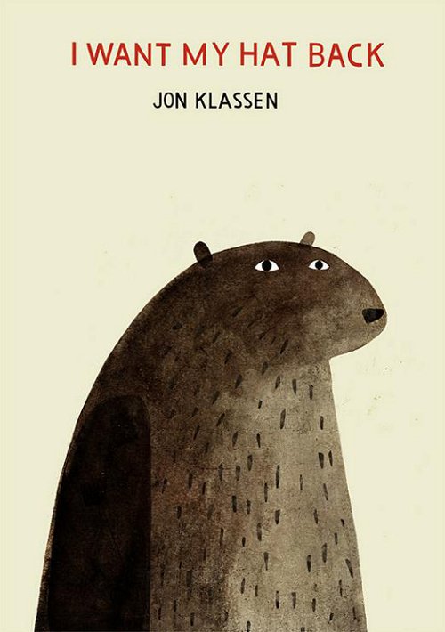
I First heard about this book through Kinokuniya's Facebook when it was first released. The moment I had set my eyes on the book (via internet) I knew that it was going to be something. And I was right. I mean how amusing is the title? I WANT MY HAT BACK is a twisted kind of picture book with a story so absurd (a good kind of absurd) purely because of its raw simplicity. It made me chuckle and smile out loud because of its damn-straight tone and seriously unexpected but oh-so-right ending. I don't think I've ever laughed or been this amused by a picture book, on its first read that is, before - so it's pretty special. I won't spoil the ending because it's worth having that experience for yourself. I think I also have a bias for things with negative spaces and minimal design - and Jon Klassen does this well so it naturally won me over almost immediately. There's also a nice rhythm set up by Klassen that draws you into the story through his writing & typography. Unfortunately I WANT MY HAT BACK is not part of my collection yet... but trust me it will be. 


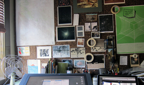
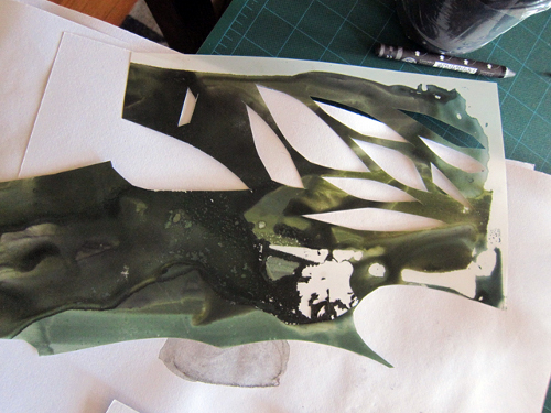
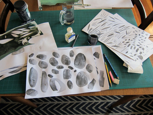
Another thing to note is the illustrations of Jon Klassen (Again I suggest you go have a look for yourself) since his works don't just stop at this picture book but extend to other formats such as animation and a range of other publications. His works incorporates both hand and digital techniques: he creates hand generated textures using a range of media usually gouache, acrylics or inks and then digitally edits and assembles them into amazing works of art. I'm also pretty amused with his sense of humour - his website Bursts of Beaden is a 'spoonerism' (only just discovered what you call these types of phrases) on Beasts of Burden. There is only thing I can say. Absolute. Genius. 
Klassen's Workspace:


And I'm also pretty excited as I hear Klassen will be releasing ANOTHER picture book somewhere during October (too far away...) But already I'm amused.


Hello Storytime

This is the first post of my Storytime series of post. It shall be all things picture books and seeing that I've started to accumulate a collection of my own  I figured it was time to do some sharing.


Bookstores are my little escape. It's the place you'll find me when I need to treat myself. I go there whenever I feel like I need a break from the world and when I find myself sighing just a little too much. Not saying that I only go there when I'm on a low - I love the space just as much when I'm feeling brighter. I always ponder around the children's section of bookstores excited by the prospect of finding a surprise among the waves of picture books whether it be a trip down memory lane, a simple laugh, or something extraordinary deep for something that's in the so called children's section. This is perhaps what takes me into awe and wonder in these supposedly naive corner of the bookstore; there are actually things for people of all ages - not only for kids. These, however, don't always explicitly show themselves. You have to find them. And its the search that makes them so special.

/Ham 

Saturday, March 10, 2012

So I made my first online purchase...

... and it looked a little something like this:


 (Yes I couldn't resist I just had to PRTSC)

Let's hope I don't suffer from the Pringle effect

Friday, March 9, 2012

Dreams & Discoveries: Eat Your Colours

Somehow I feel like the world knows exactly what I'm thinking and every time I dream up a little project or think up a little thought, my idea, still unborn in my end of the world, will somehow sprout up before me into the real world. It's a little stalkerish in a psychic sort of way... I mean I've had Frankie read my mind countless of times, where they'll feature articles and segments which were completely in-tuned with my thinking during the time (and to think they plan their issues 4 months before its release! How bizarre is that?). Let me put it into perspective:
Me: *Thought about how we're so dependent on plastic. Realised how it's everywhere in everything we use. Thought about whether one can live without it* Frankie: *30 days feature: 30 days without plastic*
Me: *Being a hoarder myself, friend linked me to A Collection A Day blog*Frankie: *Features A Collection A Day Blog*
Me: *Reflected on recent event of being asked "Where are you from". Thought about the strangeness and awkwardness of the question and being unsure on how to tackle it* (needtorambleaboutthisinanearfuturepost)Frankie: *Everyone Has A Story feature: (first line) "A lot of people ask me where I'm from..."*
I could go on but I realise I'm going on a tangent...

Anyways, so recently I dreamt up this campaign idea I wanted to call Eat Your Colours which basically promotes eating a variety of Fruit and Vegetables but in an artistic & visual way. I imagined a colour palette of fruits & vegetables arranged in classic rainbow colour wheel style, gradients of ripening fruit, and architectural cross sections of apples & pears all in fashion of minimal overhead photographs which embraced the colour and natural forms of my beautiful plant friends. Of course there's a lot more researching, planning and experimentation that needs to happen before I'm able to make it happen but for today I was pleasantly surprised with a new discovery that popped up on my Facebook feed via Anthology Magazine:


Absolutely genius edible piece of concept "Pantone Tarts" by French food designer Emilie De Griottes!

It got me so inspired - this was almost exactly the kind of thing I was aiming for in my future dream project. Even though the Pantone Tarts weren't exactly for promoting healthy colourful eating it certainly hit the spot for me on incorporating habits of the world of design into the context of food. I'll probably feature all the wonderful food/art/design discoveries on the blog section for my future dream website.

There's actually a lot of amazing things happening with the intersection of Food, Art and Design. I'm hoping to make another blog (another blog? what?) dedicated to this and share with you all the wonderful discoveries I've made during the past few years. I'm really excited for this actually... and it seems like things like these keep on coming!

Monday, March 5, 2012

I've decided to put the update on whatI'vebeenuptoforthelasttwoyears on hold and leave all that's been done & done behind for now and move on to more exciting things. I'm pretty much an inconsistent blogger and inconsistent-almost-everything but there have been some exciting ideas swirling in my head waiting for an exit into the real world... who knows if they'll survive? All I know is that I really need to start giving them a chance to be born and hopefullly, they'll grow into something magical ... otherwise they'll die from being forgotten. How lonely would that be.

Anyways, this post won't have anything... I just felt the need to post something ANYTHING just so that I can start a fresh page again without being bogged down from having to dig out my past AND just so that I feel like I've finally started a new beginning particularly in time with the very warm & rainy welcoming of Uni, March and Autumn.

Although, there is probably one thing I'd like to mention, which issss my excitement for the design subject I'm undertaking this semester which requires me to do almost-all things magazine related! I've actually been meaning to do this for a while now and post up some magical discoveries in the world of magazines I've come across.. so this is pretty much the perfect time + opportunity to start this, seeing as magazine hunting & gathering will delightedly be part of the process anyways! A March of Magazines shall it be? Sure. Why not.

/Ham
Related Posts Plugin for WordPress, Blogger...